SERVICES
UX/UI Product design
Responsive web
Product dev
UX research
AI-native platform
COMPANY
STATUS
Shipped!
Teachers in the UK are leaving the profession in record numbers. Not because they don't love teaching but because they can't find time to actually do it.
Smiling Bard is a product The Tomi Co. incubated and built in-house on behalf of UK-based teaching group: a tool that solves a real problem for real people, and proves that an AI-fluent studio can take a product from research through to a live, shipped app without a separate dev team. Smiling Bard went from interviews and research, through design system identity and product design, to a fully functioning AI-powered platform. One studio. End to end.

By the numbers
45 seconds
Time to generate a complete, structured lesson plan
3hrs+
Admin saved per week
0→Shipped
Design and AI-native build owned end to end


How it works
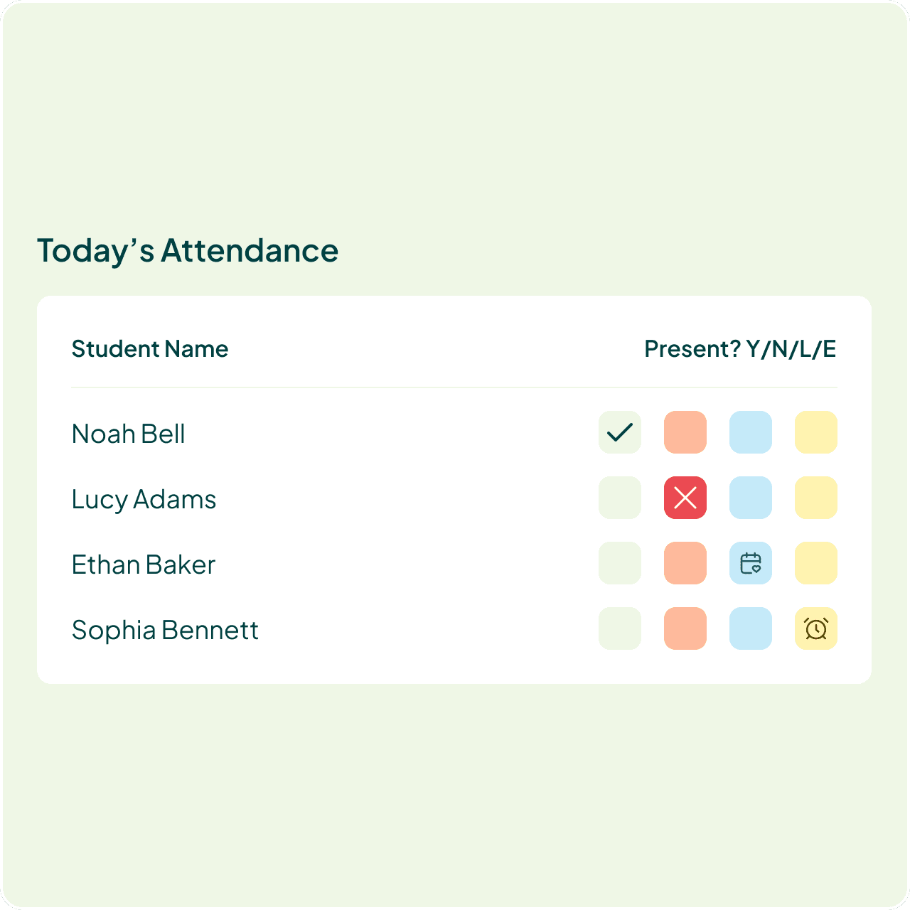
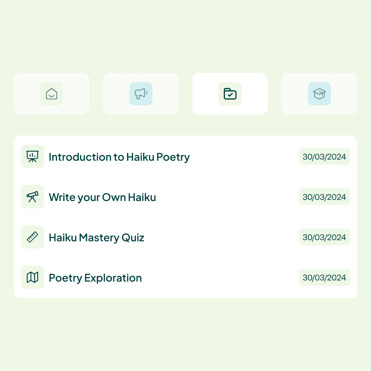
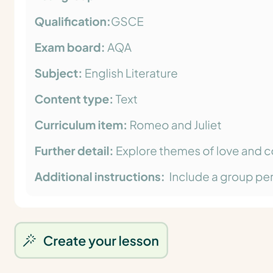
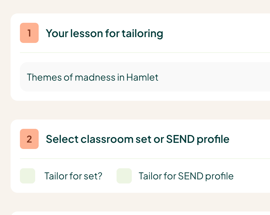
Using Smiling Bard is as easy as 1-2-3, which each resource creation process following the same UX/UI patterns, wether the use was creating lessons or full schemes of work (and in the future - homework, assessments, worksheets and more).
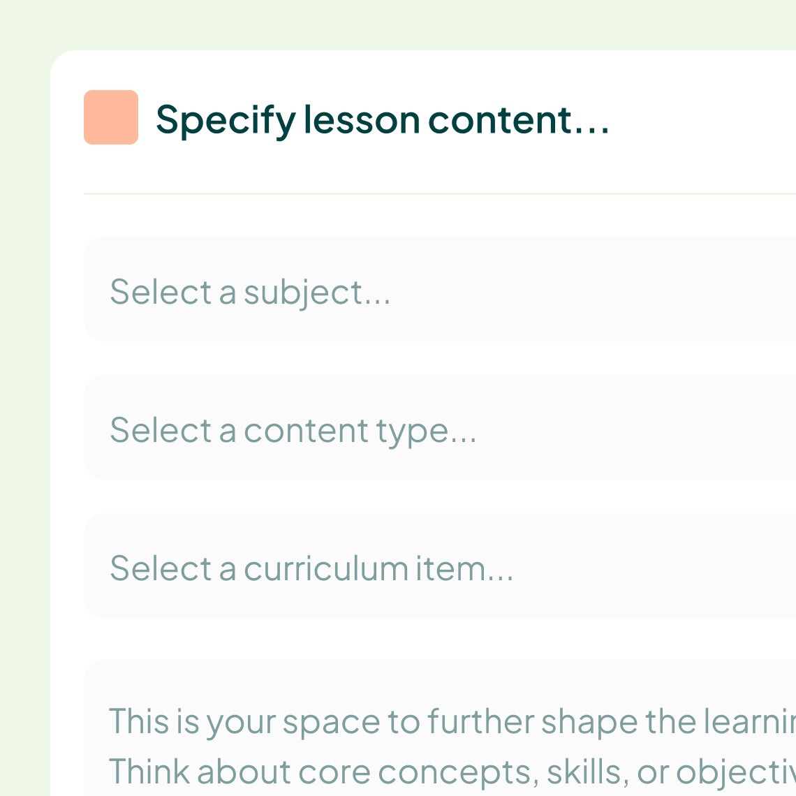
Built AI-native, not AI-assisted
Most "AI features" get bolted onto an existing product. Smiling Bard couldn't exist without AI at its core, the lesson-generation engine, powered by the Anthropic API, isn't a chatbot wrapper, it's the product. Strip it out and there's no app left.
That shaped how we worked, not just what we built. Design started in Figma, built on a variables-based design system, then connected directly into Claude Code to prototype, test and deploy real, usable software, no separate handoff, no waiting on a dev team to interpret the work. Design decisions and technical constraints got resolved in the same sitting. Framer carried the marketing site and public-facing pages, fast to iterate, fast to ship.
The product itself came together with a small, focused team: an educational consultant kept the pedagogy honest, Smiling Bard's chair shaped strategy and governance, and a comms and marketing lead found the voice that carries through the brand. The Tomi Co. owned design and the AI-native build end to end, from research and product decisions through to the shipped platform, working alongside that expertise rather than in place of it.
The discipline wasn't "let AI build it." It was knowing where AI accelerated the work and where it didn't get a vote, prompt engineering the lesson-generation logic to be reliable for a teacher under time pressure took more iteration than any single screen design. AI wrote first drafts. Judgement decided what shipped.
Key design principles.
Reduce friction at every step. Teachers are time-poor and cognitively stretched. Every unnecessary click, every moment of confusion, is a reason to give up and go back to doing it manually. The design principle was simple: complexity is the enemy. Get out of the way and let the teacher focus on teaching.
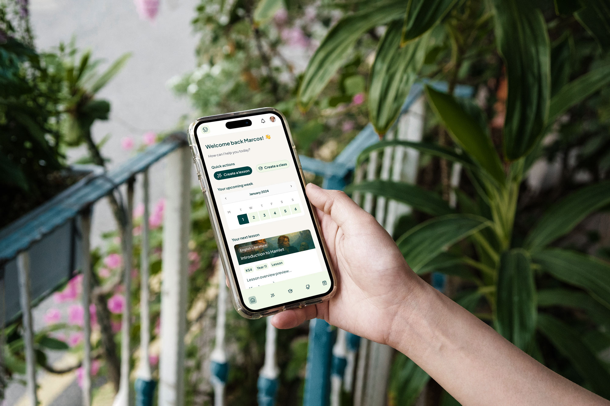
Design for the desk, optimise for everywhere. Most current products default to mobile-first. Research said otherwise, teachers plan lessons at desks, on laptops, often with multiple tabs open. Building mobile-first would have solved the wrong problem. But the spark for a lesson doesn't wait for a desk, it shows up at the school gate, on a commute, between classes. So Smiling Bard doesn't restrict either platform, it tunes the experience to how teachers actually use each one: quick capture on mobile when an idea strikes, deeper work on desktop when it's time to build out a full scheme or manage classes properly. Desktop-first wasn't reversed. It was extended to match real behaviour, not just real research.
The brand should feel like the product. Smiling Bard isn't only an app, it's a belief that teaching should be joyful. The visual identity, the name, the copy, all of it carries the same warmth and optimism as the product itself. Brand and product designed as one thing, not two.