
CASE STUDY
FOUNDER PROJECT
Teaching should feel like teaching.
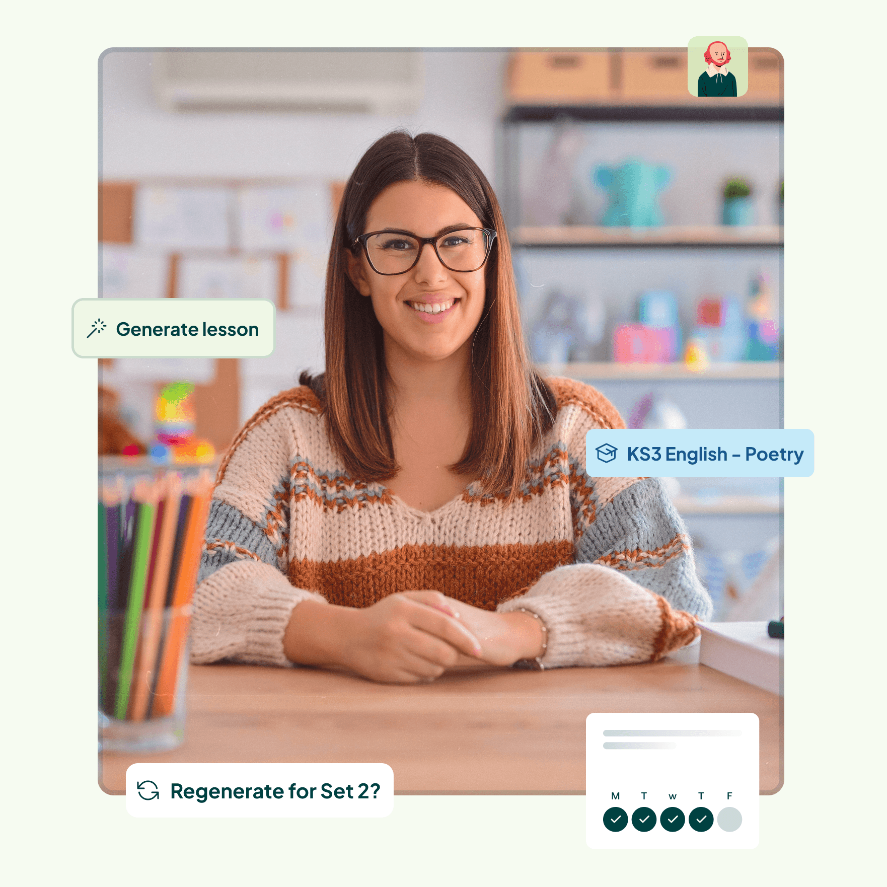
Smiling Bard: AI-powered lesson planning for teachers.
Conceptualised, designed and built by Tomi. Live now.
Product design
UX research
Design systems
Product development
Solo build
THE PROBLEM
Teachers are drowning in admin.
For every one hour of teaching, a teacher spends over three hours on planning and admin. That's not a productivity issue; it's a systemic failure that's burning out one of society's most important workforces.
Teaching is one of the fastest declining professions in the UK. The people we trust to educate the next generation are leaving. Not because they don't love teaching, but because they can't find time to actually do it.
Personalised learning has been proven to improve student outcomes. But personalisation takes time teachers simply don't have. Two problems that make each other worse.
I built Smiling Bard to give that time back.
RESEARCH & DISCOVERY
Built around teachers, not
assumptions.
Research was not a phase. It was a continuous thread woven through the entire build. From early problem definition through to live testing, real teachers shaped every decision.
I started with face-to-face interviews to understand the texture of a teacher's day. Not survey responses, but honest, unfiltered conversations. I cross-referenced what I heard with government agency data, academic papers and published research on teacher workload and personalised learning outcomes.
As the platform developed, I brought teachers back in. I demoed the app, watched them use it, and listened carefully, capturing feedback on lesson content quality, structure, UX and UI simultaneously. The goal wasn't to just validate what I had built: It was to understand what actually mattered to them, and design around that.
This is the principle that shaped everything: the platform should work the way teachers think, not the way a designer assumed they should.
PRODUCT
A lesson in less time than it takes to make a cup of tea.
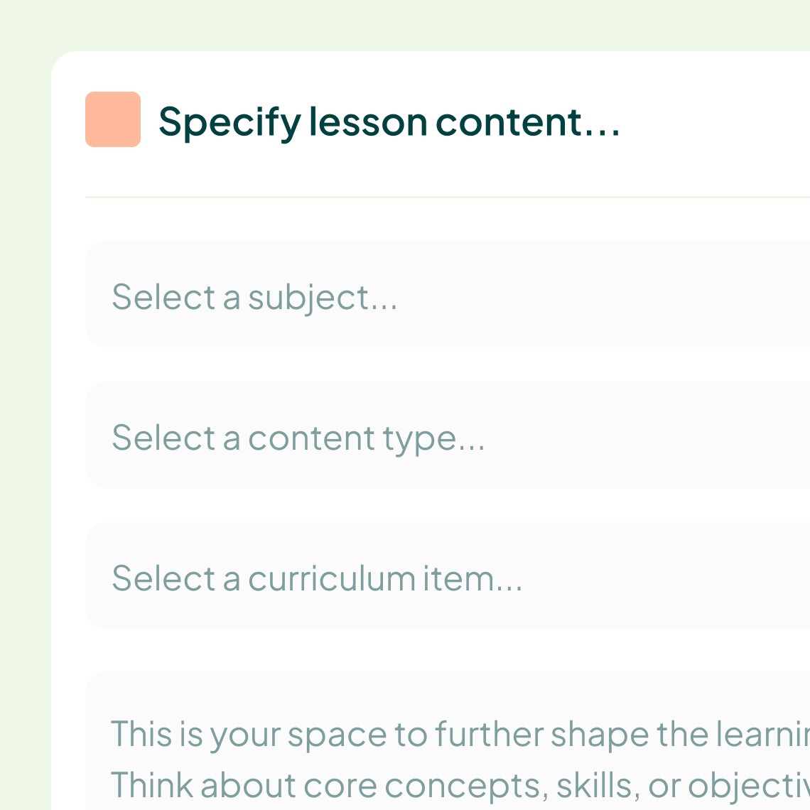
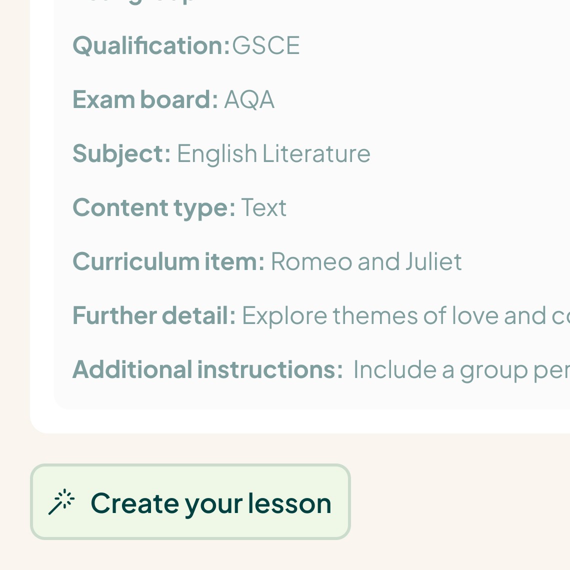
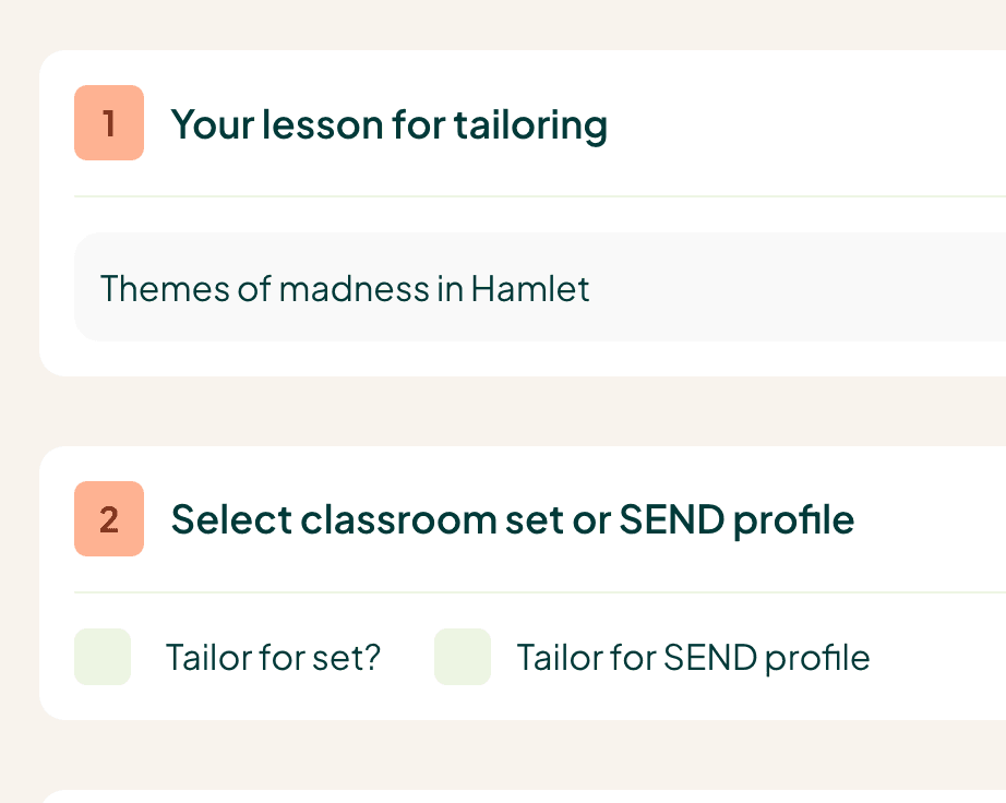
A teacher opens Smiling Bard, selects their parameters from a series of dropdowns, adds a free-text description of their lesson, and hits one button. In 45 to 60 seconds they have a complete, structured lesson resource ready to edit, personalise and use.

DESIGN PROCESS
Built like a product studio.
Smiling Bard was designed and built entirely by one person (me) using a solo agile sprint framework, a component-driven design system, and the same rigour I bring to enterprise-scale client work. Every decision was intentional. Every component built to scale.
TECH STACK
The right tools for
the right outcome.
Technology choices were deliberate. Bubble enabled fast, high-quality product delivery without sacrificing the user experience. The real IP lives in the AI model, a trained system with a stress-tested, precision-engineered prompt that generates structured, curriculum-aligned lesson resources consistently and reliably.
The platform was built desktop-first, a deliberate decision rooted in research. Teachers plan lessons at desks and on laptops. Building mobile-first would have solved the wrong problem.
Design
Figma
Full design system, component library, interactive prototypes.
PLATFORM
Bubble.io
Full-stack no-code platform. Fast to ship, easy to iterate.
WEBSITE
Framer
A beautiful website made quick. Used for front-end pages with Bubble for the backend.
INTELLIGENCE
Trained AI Model + OpenAI
Precision-engineered prompt. Stress-tested for quality, consistency and curriculum alignment.
THE VISION
The world's greatest lesson planning tool.
Smiling Bard does not replace teachers. It works with them, handling the admin so they can focus on what they came into the profession to do: teach.
The next phase unlocks a connected resource ecosystem. A generated lesson becomes the foundation for assessments, worksheets, class activities and slides. All in moments, all from a single source of truth.
The name says it all. Shakespeare, synonymous with education and academia. Smiling, because joy is what every teacher deserves to feel in the classroom. That is what we are building towards.
Interested in what
I can build for you?
Smiling Bard is one example of what happens when design thinking, product instinct and technical execution come together. Let's talk about yours.